It's worth taking a look once again at the state of typography today. When one does this as an outsider, who occupies himself more with the stylistic characeteristics of the epoch than with the ephemeral manifestations of momentary fashion, and if one sees in typography primarily a means of creating cultural documents, th[e]n one can impartially deal with the problems which grow out of typographic material, their suppositions and their design.
Recently, one of the well-known typographic theorists remarked that the "neue typografie," which had enjoyed increasing popularity from 1925 until 1933 in Germany, had been primarily used for printed advertising matter and that it was obsolete today; for the design of normal printed matter, such as books and, above all, literary works, it is unsuitable and should be abandoned.
This thesis, seemingly supported to the uninitiated by shabby argumentation, has been causing trouble here for several years now and is all too well known. It is the same thesis that is held up against every new artistic development. This either comes from an earlier advocate of the direction now under attack or from a fashionable convert, when they themselves have lost their vigor and belief in the future, and retreat back to the "tried and true." Fortunately there are always young forces who don't blindly surrender to such argumentation and who look forward to the future. They search unwaveringly for new possibilities and furthere develop the principles already gained.
We witness opposing currents in every area, above all in the arts. We know painters, who, after an interesting beginning that logically arises out of a contemporary view of the world, began to express themselves later in reactionary forms. Above all we know this development in architecture, where instead of following available progressive knowledge and further developing architecture, decorative solutions are sought on the one hand while opening up to each and every...
... reactionary undertaking on the other hand, the most striking of which we know all too well by the name "heimatstil" [vernacular style]. All these people claim to have taken that which was present in 1930 at the onset of a new development and to have developed it furtehre to a modern direction valid today. They glance haugtily down upon (in their view), "those left behind," since for them the questions and problems of progress are settled until a new fashionable manifesto is found.
Nothing is easier today than realizing that these people are fooling themselves, just as we repeatedly did in the course of the last few years. They fell victim to clever "propaganda culture" and became proponents of a direction which has conspicuously led to a debacle, above all a political one. They represented themselves as "progressive" and unknowingly became the victims of a spiritual infiltration useful to every reactionary current. Nothing could be worse today than to continue to intellectually support those followers of "progress." Instead, their right should be taken away to defame those who have also offered resistance in the intellectual-artistic area, further developing their theories and the resulting work, as in typography.
It would be idle speculation to discuss the issue, if this was "back-to-theold-typeface-epidemic" were not increasingly spreading. It's worth pursuing the reason for this development.
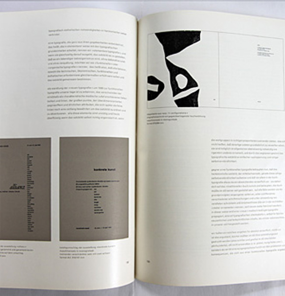
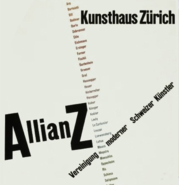
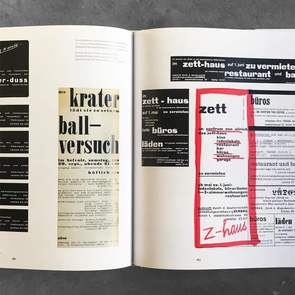
Few professions are so receptive to simple schematic rules, with which they can work with maximum safety, than that of the typographer. He who produces this "recipe" and understands how to surround it with the appearance of being right, determines the direction which holds sway for a time over typography. One must clearly keep this in mind when viewing the current state of things, above all in Switzerland.
Every posited theory that is fixed and unchangeable contains the inherent danger of becoming inflexible and blocking development over time. But it is very unlikely that the so-called "asymmetric" or organically formed text layout would be more quickly obsolete through progress than the mid-axis type, which primarily corresponds
to a decorative and non-funcitonal view of things. Fortunately, we have liberated ourselves from the renaissance model and do not want to return to it again; rather, we want to take advantage of this liberation and its potential. The lack of principle in the old model has been conclusively proven – more convincingly than the return to this model. Experience teaches that modern typography was on the right path in 1930.
Maria Pimenova . 2022 . Font-family used: "Gill Sans","sans-serif"