Mike McQuade is an American artist, illustrator, and graphic designer who lives and works in Richmond, Virginia.
When one looks at Mike McQuade’s work, it is clear that he has exceptional skills in many areas, such as branding, illustration, design, collage, and typography. His collage works use careful crops of images that appear torn apart, giving them a hand-crafted appearance. His collage work consists of a minimal greyscale palette with an accent color. Mike McQuade’s intentional use of materials, color choice, imagery, pattern, and repetition convey a strong concept and meaning in his works.
Mike McQuade got into graphic design in high school, where he was interested in skating and its community. The community’s logos and branding sparked his interest in brands and working with their visual identity. Originally an animation major, he graduated from the Art Institute of Philadelphia with a degree in Graphic Design. His first job was with a small company called Avenue Razorfish, which is now known as just Razorfish, as a designer of their marketing banners. Even though he believed the work was “cut and dry, not that exciting” (brandisea.com), he still appreciated the work he did with the brand and other small companies along the way. Today McQuade has over 11 years of experience in the field and is a regular illustrator for many high-profile publications.
Illustrator, artist, and graphic designer Mike McQuade
The McQuades Design Studio
Mike McQuade and wife Nicole co-founded their design studio, “The McQuades,” in 2015. Mike does much of his work alongside Nicole in their studio. Like her husband, Nicole McQuade is a freelance designer and illustrator, and she specializes in branding, info graphic design, long-format design, collateral design, and illustration.
The McQuades’ collective small studio is in Philadelphia, Pennsylvania. They believe that, at its core, great design is problem-solving. The two see branding as a core part of their studio and approach all branding with the same creative process, regardless of the size–by finding the company’s essence and building its visual identity. The McQuades often use illustration in their graphic design work and see the goal of illustrating as solving a problem and conveying a message. Like their branding approach, they first look for the concept and then the style.
The McQuades design studio logo is simplistic, with a slab-serif letter “M” above a horizontal bar
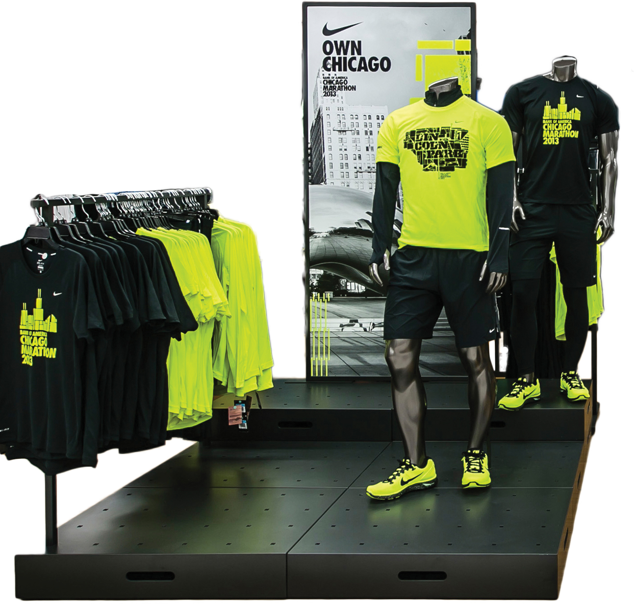
2013 Chicago Marathon
The 2013 Chicago Marathon was the 36th edition, held annually in October. As the Marathon has increased in popularity, more local, national, and international charities and humanitarian organizations have participated in sponsorship as a means of fundraising. The McQuades worked with Nike on their campaign for the 2013 Chicago Marathon, allowing him to showcase his exhibition design, illustration, and typography skills. The team created graphics for window displays, which McQuade constructed from concrete and neon lights, and displayed at local running stores.
The bright colors contrasted against the black and drew people in. When locals wore brightly-colored clothing displaying graphics of their city, it expressed their Chicago pride during one of the nation’s largest marathons.
Display section in a Nike store featuring the brightly-colored clothing
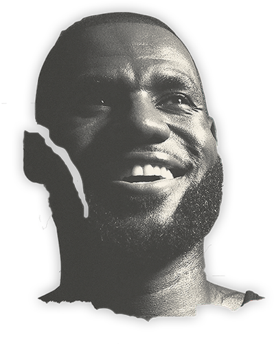
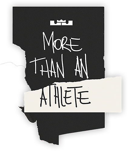
2018 LeBron James World Tour
Mike McQuade did poster work with Nike Basketball for the 2018 LeBron James World Tour alongside creative director Michael Spoljaric and art director and designer Jason Sfetko.
The image pieces for this section are taken from one of the posters done by McQuade, Spoljaric, and Sfetko.
James does these tours annually, focusing on empowering youth, promoting community service, and staying healthy and active. McQuade and his team worked primarily with a color palette of black, white, grey, and a red-orange color that resembles a basketball.
The posters follow a composition similar to a collage, with images of young and present LeBron James, presentations of Nike athletic shoes, motivational quotes, and the Nike symbol in the bottom right corner. He cropped them to look like they were ripped from a scrapbook, giving the posters an organic, dynamic energy.
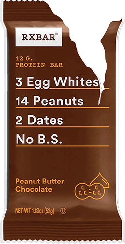
RXBAR
The McQuades partnered with packaging professionals Scott & Victor to craft the visual identity design for the health food brand RXBAR, including the logo and packaging design, icon development, color palette development, and style guide.
RXBAR aims to make protein snacks from simple, minimally processed ingredients without anything artificial. McQuade showed this on the packaging of the bars that list the small number of components, followed by the phrase “No B.S.” Each bar’s packaging is simple and minimalistic to reflect the nature of the products. Each packaging has up to four colors and a simple line art logo.
Example of the RXBAR packaging by McQuade and Scott & Victor
Herb & Lester
Mike McQuade created an identity system and cover for the London-based company Herb Lester Associates.
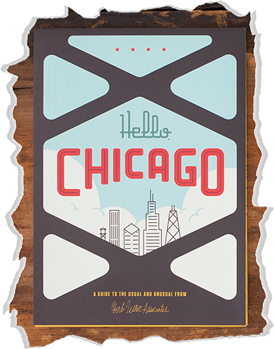
The travel guide title, “Hello Chicago,” is featured on the front cover, warmly welcoming the viewer. “Hello” is shown in a geometric script typeface with a darker blue sky tint, giving it a lower contrast. The blocky “Chicago” is in orange, which is complementary to the sky blue of the background. The high contrast and large size make it the first word the viewer sees. Simple off-white clouds paint the horizon and accompany the blue sky; thin black lines make up the city skyline. A dark grey fence frames the cover. The condensed typeface text appears, “A guide to the usual and unusual from,” and the script, “Herb Lester Associates,” displayed in a dull yellow that beautifully contrasts the grey.
The front cover for “Hello, Chicago” | 2017
The NY Times
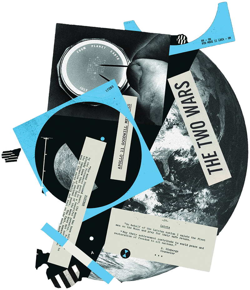
Mike McQuade has also done illustrations for the New York Times. He collaged NASA photos and graphics to accompany the article “Words from an Upside-Down World,” an article published in a special section in The Times commemorating the 50th anniversary of the first moon landing in 1969. Science fiction writer Ken Liu explains that power politics overshadowed the positive potential of the Apollo program. The collage shows this idea, interpreted loosely as half Earth and half other parts. Within the other half, the large text, “THE TWO WARS,” represents those for and against the Apollo program. The collage features a cropped excerpt of a quote from the Latvian leader at the time, Anatols Dinbergs, stating that the moon landing would largely contribute to restoring freedom and peace. The color palette of the collage is primarily greyscaled, with accents of a light cool blue, which gives the piece an almost ironic relaxed look.
“Words from an Upside-Down World” | 2019
Depactus
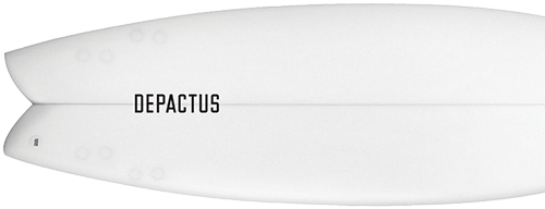
The McQuades collaborated with the marketing and advertising company Instrument to create a visual brand identity for the surf-centered company Depactus.
The logo features condensed type and rectangles in ascending size, representing a horizon over the ocean. The primary color scheme is navy blue, gold, and white. Depactus can pair the three colors in any combination, providing excellent contrast. The collaboration also created posters and T-shirts for Depactus that visually represent the brand’s slogan: “where land meets sea.” One shirt they designed shows a wolf on its hind legs in a style that makes it look like a medieval woodblock print. This dynamic pose gives the brand a fierce, unruly look, like rough waves in the ocean.
Though the brand is relatively small, The McQuades and Instrument successfully equipped them with a visual identity that communicates the “raw, authentic, and unfamiliarity” of Depactus.
Depactus logotype displayed on a surfboard
Conclusion: A Young Gun
His talents have not gone unnoticed. He is the recipient of the 2011 ADC - Young Gun 9 award, which recognizes the skill of creative professionals 30 years old and younger. He believes hard work, persistence, optimism, and mistakes lead to improvement.
“No matter how good the execution or style of a piece, it will not work without a great idea.”
References
“Chicago Marathon.” October 16, 2022, accessed October 27, 2022.
https://en.wikipedia.org/wiki/Chicago_Marathon
McQuade, Mike. “About.” Accessed October 27, 2022. http://www.themcquades.com/about
McQuade, Mike. “Depactus.” Accessed October 27, 2022.
http://www.themcquades.com/depactus
McQuade, Mike. “Nike Chicago Marathon.” Accessed October 27, 2022.
http://www.themcquades.com/nikechicagomarathon
McQuade, Mike. “RX Bar.” Accessed October 27, 2022. http://www.themcquades.com/rx-bar
“Words From an Upside-Down World.” 2019, accessed October 27, 2022.
https://store.nytimes.com/products/words-from-an-upside-down-world?variant=29407388827718
“Young Guns 9 / Mike McQuade.” Accessed October 27, 2022.
https://www.oneclub.org/awards/youngguns/9/-bio/yg9-2540-mike-mcquade