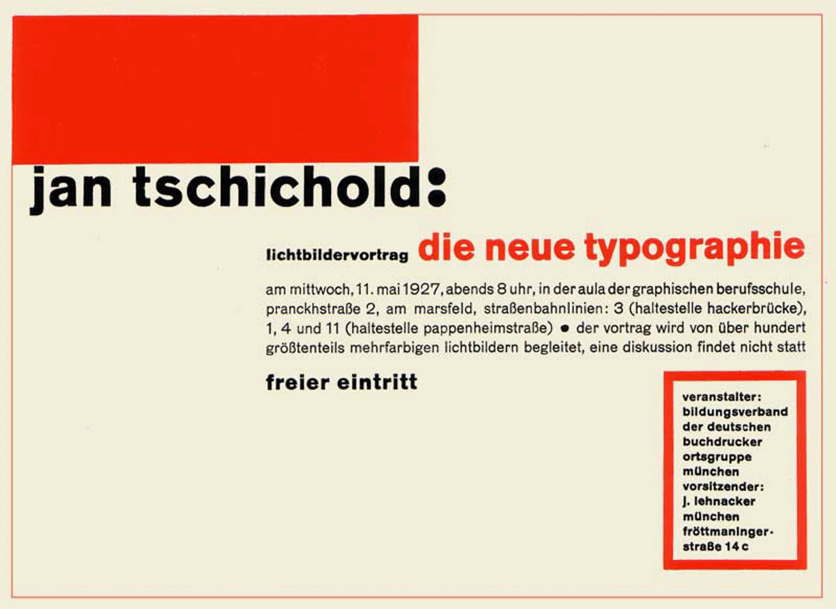
The article, 'on typography', by the Zurich painter and architect Max Bill in the last number [of Schweizer Graphische Mitteilungen] seems to have been triggered off by my lecture 'Constants in Typography', delivered last December to the Zurich members of the Association of Swiss Graphic Designers. In this lecture I criticized the 'New Typography' which I helped to disseminate—and therefore myself also—severly. Bill was not among my listeners. The half-understood, grossly distorted quotations from my lecture must have come from second or third hand. Without having informed himself at the source, Bill used this misinformation for a fanatical attack on book typography as practiced by myself, Imre Reiner and others.
What I actually said (to quote correctly the words Bill put in my mouth) was: 'The New Typography has indeed not yet been superseded, but it has proved itself to be suitable only for advertising and jobbing. For the book, and particularly for literature, it is completely unsuitable.' I still stand by my textbook, Typographische Gestaltung (Basle: Benno Schwabe & Co., 1935). I would change scarcely a word of it, but in a new edition I would delete the final chapter on book typography.
Since my 'threadbare' and 'reactionary' arguments may interest the readers of this magazine, I would like to present them here, without fear that they may 'cause mischief'. I am not, by the way, one of the 'well-known typographical theorists', but, to the best of my knowledge, the only on in German-speaking Europe.
Imre Reiner would probably protest against such a title for himself; he is a fertile and provocative source of ideas rather than a theorist. But I am not merely a theorist, as Bill in fact is; I can look back on more than twenty years' experience as a typographical designer. From 1920-5 I taught lettering at the Academy for Graphic Arts in Leipzig; I also taught typography and lettering for seven years at Basle in 1933 as designer to two large printing firms. From 1919 until now I have designed not only innumerable pieces of advertising and other printed matter but also hundreds of books of every kind. This extensive practical work and the experience it has brought give my words a different weight from that of the theories of an architect from outside the trade who describes himself capable of 'tackling without prejudice problems that grow out of the typographic materials, their requirements and their design', words which, by the way, do not make sense.
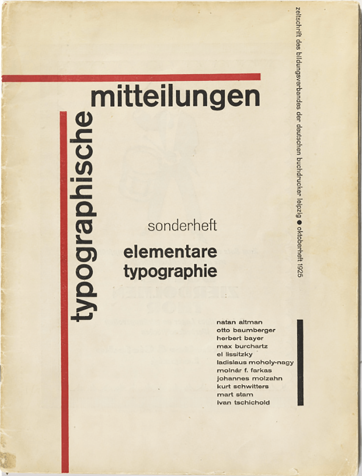
The derivation of typographical rules from the principles of painting formerly known as 'abstract' or 'non-objective' and now called 'concrete' (Lissitzky, Mondrian, Moholy-Nagy) resulted in a valuable and temporarily novel typography. But it seems to me no coincidence that this typography was practiced almost exclusively in Germany and found little acceptance in other countries. Because its impatient attitude conforms to the German bent for the absolute, and its military will to regulate and its claim to absolute power reflect those fearful components of the German character which set loose Hitler's power and the Second World War.
I saw this only later, in democratic Switzerland. Since then I have ceased publicizing the New Typography. The creators of the New Typography were, like myself, most vehement enemies of Nazism (only two, Prof. M.B., Essen, and Dr. W.D., Jena, went over to it). At the beginning of the so-called Third Reich my wife and I were taken into 'protective custody' for an extended period, i.e. we were thrown into prison and I lost my teaching position in Munich. Since freedom of thought and work for me come before everything else, I left my homeland and moved to Basle.
For we considered ourselves pioneers of 'progress' and wanted nothing to do with such obviously reactionary things as Hitler planned. When Hitler 'culture' called us 'cultural Bolsheviks' and called the works of like-minded painters 'degenerate', it was using the same obfuscating, falsifying methods here as everywhere else. The Third Reich was second to none in accelerating technical 'progress' in its was preparations while hypocritically concealing it behind propaganda for medieval forms of society and expression. And since deception was its basis, it could not bear the genuine modernists who, although political opponents, were nevertheless unwittingly not so far from the delusion of 'order' that ruled the Third Reich. The role of leader that fell to me as the only specialist of the group was itself a 'Führer' role, signifying, as it did, an intellectual guardianship of 'followers' typical of dictator states.
The New of functional Typography is well suited for publicizing industrial products (it has the same origin), and it fulfills that purpose now as well as then. Yet its means of expression are limited because it strives solely for puritanical 'clarity' and 'purity'. This changed only circa 1930 when seriffed types were accepted as permissible means of expression. It became clear that only types of the nineteenth century could be used; I finally discovered that the New Typography was actually nothing more than the fulfillment of what the progress-happy nineteenth century had been striving for. And in the type-mixtures of the later New Typography, only the types of nineteenth century could be used. Bodoni was the forerunner of the New Typography insofar as he undertook to purge roman type of all traces of the original written form and - fortunately less radical than some of his recent twentieth-century disciples - to reconstruct it from the simplest possible geometric elements.
But there are many typographical problems which cannot be solved on such regimented lines without doing violence to the text. Every experienced typographer knows this. Many jobs, especially books, are far too complicated for the simplifying procedures of the New Typography. And the extremely personal nature of the New Typography presents grave dangers to the coherence of a work when the designer cannot continually check each page and deal with all the minute problems that arise. For it has been shown that the apparently simple rules of functional typography are not common knowledge, because they spring from a special, in effect fanatical, attitude of conspirators into whose group one must first be 'initiated'. Traditional typography is quite different: it is far from being unorganic, it can easily be understood by everybody, its finer points are not difficult to appreciate, it presumes no sectarianism and its application in the hands of a beginner does not produce nearly so many blunders as the New Typography in the hands of the uninitiated
Bill's present-day typography is marked, like my own work between 1924-35, by a naïve worship of so-called technical progress. The designer who works in this manner values the mechanical production of consumer goods—a characteristic of our times—to highly. We cannot escape manufacturing and using such goods, but we need not place halos over them, just because they come off the conveyor belt assembled with the latest 'efficient' methods.
The machine can do everything. It has no law of its own and cannot shape anything by itself. Its products are given form by man, by the designer's will, even when he believes himself to be 'obeying its laws' and that his 'objective' and unornamented designs are 'impersonal'. The work of a one-hundred-percent 'modern' designer is far more individualistic than items produced unambitiously, anonymously, unthinkingly -- which must not prevent us from recognizing a product to be good of its kind and preferring it when it serves its purpose as well as another. But the non-artist does not care in the least if the manufacture of his typewriter or whatever called for a minimum of production time or if the hydraulic press was overloaded. He does not even care if the workers are justly paid, a matter that actually should be of concern to him. He asks only that the typewriter be useable and is happy if it is also cheap.
An artist like Bill probably does not realize what a price in blood and tears the use of efficient production methods as cost 'civilized' humanity and every single worker. For these new machines give Bill or another designer time to play but not to the worker, who, day in and day out, has to tighten the same screw. Since his job cannot satisfy him, this worker seeks relaxation in sports on Sunday and with his stamp collection or some other hobby in the evenings. How different for, say, a gardener, whose work satisfies him and who probably does not think of 'relaxing' at the cinema. Proudly, though here and there quite wrongly, Bill notes in his captions that his examples were machine-set. He forgets that the hand compositor, who must make up and complete the work of the keyboarder, has nowhere near the satisfaction from his work that his grandfather could have found in it. Since he always handles type already set, he cannot finish his day with a feeling of having completed a job by himself.
For the worker, mechanization has thus taken a heavy , almost deadly toll of his meaningful work experiences, and it is simply out of place to set it on a pedestal. That mechanization is 'modern' does not mean that it is also valuable or even good; more likely it is not good. Bus since we cannot go on without it, we must simply accept it as a condition and not worship it because of its origin!
An ugly telephone bothers an aesthetically oriented person like Bill or myself, but we should not then think that a properly designed telephone is a work of art, or a symbol of it. It is only an instrument, like a hammer -- nothing more. It is only what we can do with it that is of value.
The telephone has only recently reached its more or less final form. There are many things which have been invented within our lifetime and which carry the stamp of engineered industrial production methods. Their forms, the car's for instance, have experienced a rapid development and are no doubt a testimony to our time, although by themselves they may well be without value. The most modern products of our 'culture' are the 'V' weapons and the atom bomb. These are already on the way to determining our way of life and will certainly affect our future.
Believers in progress think they must now reform old things in the spirit of the new. Among them are those which can be changed because their technical character has changed, like the lamp. To make an electric lamp that looks like an old-fashioned oil lamp is nonsense. But apart from this, there are things that have long since reached perfection in form: the riding saddle, scissors, the button.
The book, too, completed its development long ago. Except for foxed paper, occasional poor presswork and a different orthography, a 150-year-old book is just as 'practical' as a new one. Indeed, a book today is seldom so well made. Its format is often less practical and it is composed with less taste and affection. Today's poets can consider themselves lucky when their works are anywhere near as well printed as those of their eighteenth-century colleagues. The observance of typographic rules which have taken centuries to form is no more being eclectic or history-bound than the use by machine manufacturer of another engineer's patent. On the other hand, it is typical of immaturity to want to dump old rules overboard. One must not -- heaven forbid! -- follow the herd; one must abandon outworn conventions, be 'modern' and go it alone. Anyone is free to act in this way - but at his own risk.
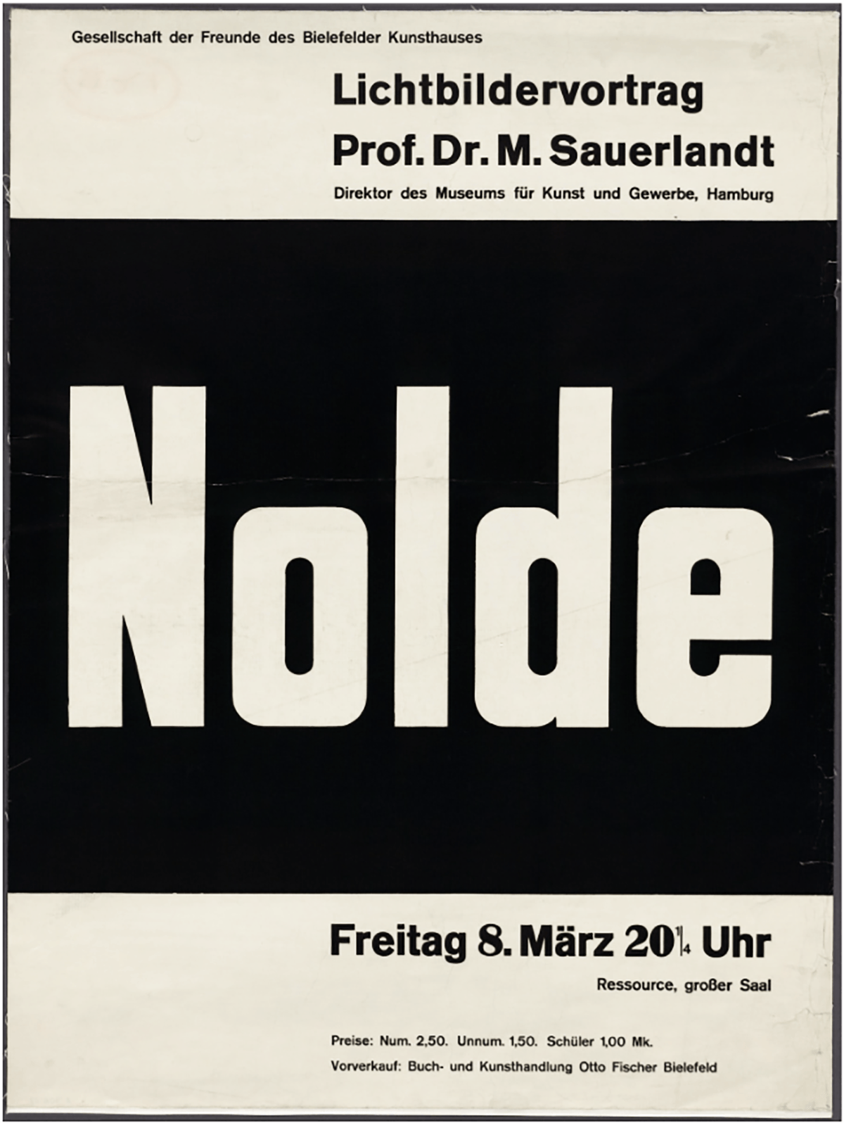
Bill has designed a small number of books and catalogues. Almost without exception they belong to the fields of the new architecture and the new 'concrete' painting. It is absolutely correct to derive the typographic style of such works from the rules of concrete painting, just as it would be correct to follow baroque typography in a book of baroque poems. Both architecture and typography are applied arts. It is gratifying and right that here and there the photographically illustrated book had developed a style of its own, since the photograph forms a new element posing new design problems. Magazines, too, can be laid out in this style. The attractive magazine Du, for example, maintains the best tradition of the New Typography without following Bill's overly strict dogma. I have myself, long before Bill, designed a number of catalogues in the New Typography style which even today I consider suitable, but not exclusively so (cf. the Basle Gewerbemuseum catalogue on type-faces, Die Schrift).

All of Bill's books show great feeling for form and a sure taste; of their kind they are exemplary. But when Bill teaches that this style is suitable for every other sort of book he shows either a lack of understanding for books whose content is not familiar to him or a dogmatic obstinacy. Other than Bill and a certain Basle sociologist, no one believes that. Novelty and a surprising form are tolerable only in a small group of books; in most others they are disturbing and obtrusive.
Obeying good rules of composition and book design in the manner of traditional typography is not 'putting the clock back'; but an eccentric style of setting is almost always debatable. Thus, the layout of Bill's article is exciting because unusual, but is not to be take as a model for general imitation. I mention parenthetically that the ragged-right setting Bill uses was first introduced about 1930 by Eric Gill, the great English type designer, and had less point in machine than in hand composition. (For while and hand compositor must take trouble to justify lines evenly, the machine takes care of this automatically and quite well, except for a few faults that only the hand compositor can avoid.) So it is only an apparent simplification and apparently modern in form.
Much more dangerous is Bill's lack of indentations. He marks paragraphs by extra space. Not only does this produce big gaps in the text, but more importantly, it does not guarantee the recognition of new paragraphs, especially at the beginning of a new page (as occurs on page eight of Bill's article). For more on indenting, see my article in the February (1946) issue of Schweizer Graphische Mitteilungen.
To show the Chinese classic in a European language is better set in our traditional typography, I illustrate a page from Chung T’si and next to it the continuation in the New Typography. Exempla docent. That not every title page can be set inthe empty manner of the new or functional Typpography is shown in Hafis, a collection of Persian poems, and the facing illustration. The art of the book demands, after all, tact and imagination.
Even the choice of Bodoni for the “functional” Hafis title page may to Bill appear to be a compromise, because he holds the sans serif still to be the best, the ‘up-to-date’ typeface. But reading long pages set in it is genuine torture, as is graphically shown in the unreduced reproduction from a book that actually appeared (Berne 1942). The sans is not a new face, having appeared in the first third of the nineteenth century. It is primarily useful for titles and only short paragraphs of text, since its lack of sufficient articultion and indispensible serifs, togethwr with unvarying stroke weights, make it difficult to read. It is simple only at first glance and corresponds only to the undeveloped perceptions of children learning to spell and to whose unpracticed eye the genuine letterformsof printing types appear as complicated as the handwriting of a twelve-year-old schoolgirl.
It is no coincidence that most followers of the functional typography want to know little or nothing of the better sans serif formulations of today’s type designers (Eric Gill’s Sans, W A Widdins Metro). These show the true calligraphy of the present day and tower above the deplorable level of the common sans serifs (Akzidenz grotesk, Monotype series 215) which Bill likes to use.
The best most legible types that are available to us are the classic faces (ie, Bembo, Garamond, Van Dijk, Caslon, Bell, Baskerville, Waldbaum) and those new ones that differ but little from them (Perpetua, Lutetia, Romulus and several others). That faces of both kinds are available today is the special achievement of Stanley Morrison during twenty-five years’ activity with a leading English firm. The rebirth of the classic types brought with it a classical revivel the world over that is at least as important was the cleaning-up process of the New Typography for Germany.
But the technical principle of machine composition has not had the slightest influence on typographical design methods. Machine composition imitates hand composition, the nearer the better; if it had other optical aims, such as mere technical expediency, it would come close to the unusable, optically inadequate compromise of a typewriter type. Machine composition is neither cheaper (Switzerland 1946) nor better than hand composition except for the newly cast printing surface it produces: it is less flexible and not at all easier to handle than hand composition. Though it is more efficient t is in no way able to change the material appearance of typography by means of some ‘mechanical’ law of its own. Bill is not himself able to recognize machine composition; not everything he claims ought to be, or could be, set by machine is in fact so. For the good keyboarder, like the hand compositor, strives for optical perfection, a perfection which was reached as early as the sixteenth century and has not been bettered since. Further, the limitations of certain typesetting-machine systems have produced bothersome letterforms that disturb the educated eye, while types for hand composition allow, thanks to their unlimited number of set widths, the ultimate in optical finesse. That is far more than Bill, a laymen, realizes.
Unlike the book, promotional printing has developed in our time, a true child of the uindustrial age. Since advertising requires novelty and surprise, the New Typography with its new forms enjoyed favor for a time – as long as it was still ‘new’. But when its ascetic character was well known enough, the search for other new forms began, some of which naturally tended to the other extreme forms of typography. This can have a certain refreshing effect, like a flower in rocky terrain. It would be wrong to see ornamenatl typography, incidentally only occasionally suitable, as the modern form: bothe are modern if one refrains from investing in the word ‘modern’ with value judgements. It does not signify ‘novel’ or ‘new’ but rather that something was produced today, not twenty or a hundred years ago, and thet things–good or bad–are now manufactured that way.
Since nothing new remains new forever, the appearance of typography will continue to change, perhaps to the point where today’s competitive economic system will have to give way to one based merely on what is needed. he who does away with surprise the goal that puritanical, functional typography aims for, will learn a lesson when he has to fulfill the sometimes unreasonable wishes of his customers. It is a signifigant deficiency of the New or functional Typography that it is not suitable for work which must reflect the character of an institution. It is forced to extreme solutions which are often far from ‘practical’ (eg, use of several colours, superfluous halftones, expensive paper, etc).The enduring contributions of the New Typography are tight typesetting and better composition, better typefaces, and the dissemination of useful rules, which Bill disapprovingly calls “recipes.” If one troubles to sift them away from my writings, these rules emerge:
- fewest possible typefaces
- fewest possible type sizes
- no letterspacing of lowercase
- (still seen in German-speaking countries today,
- most often in provincial newspapers)
- emphasis by using bold or italic of the same face
- capitals only as an exception, then always carefully letterspaced
- formation of groups, not more than three
Bill himself does not realize how faithfully he follows these ‘recipes’ of mine: I could cite nearly all his typographical works as examples of their correct use. It is obvious that not everyone who obeys reasonable rules of typography can be a good designer. There will always be bad imitators. I can no more be held responsible for my imitators than I hold Bill responsible for his.
I am no friend of a parochial ‘old worlde’ style; the traditional typography that I defend here is not that, though something similar likely still exists. Even in Germany we called the efforts of Rudolf Koch and his followers the “national widlife sanctuary.” Ending with Marathon (Koch Klingspor 1931), the ‘sanctuary’ harboured Post-Antiqua and Post-Fraktur and, three degrees below it, the bastard gothic types of the Third Reich (Tannenberg, Deutschland, National). I cannot stand these types. They spring from a reversal of the quasi-religious belief in progress, such as Bill stands for, a sentimental flight into and irretrieval past. (These types are, by the way, also ‘modern’.)
f the newly revived traditional typography were the outcome of Nazi propaganda, such as Bill dares to claim, the typography of the whole world, Russia included, would have been influenced by it decades ago. I practise and preach a typography which , good or bad, is used everywhere. for i believe it is a waste of time to set on a pedestal one stage of typographical renovation process, such as German typography was going through around 1930.
Bill hints that he has been defamed. Nothing could be farther from my intention. I cannot believe that in my own lecture I mentioned Bill’s name or work, which, as I explained above, I accept unreservedly. What bothers me most is that he seems to deny me the right to work in the way I find best. As an artist he must know that a creative person can only work in the way he believes right. He who calls for the suppression of freedon of thought and artistic expression carries on the gloomy busines of those whom we thought were defeated. He commits the worst crime, for he buries our highest worth, the sign of man’s worth–freedom. Which perhaps a man must first lose, as I did, before he discovers its true value.