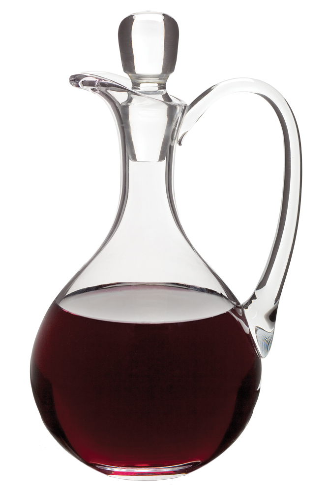
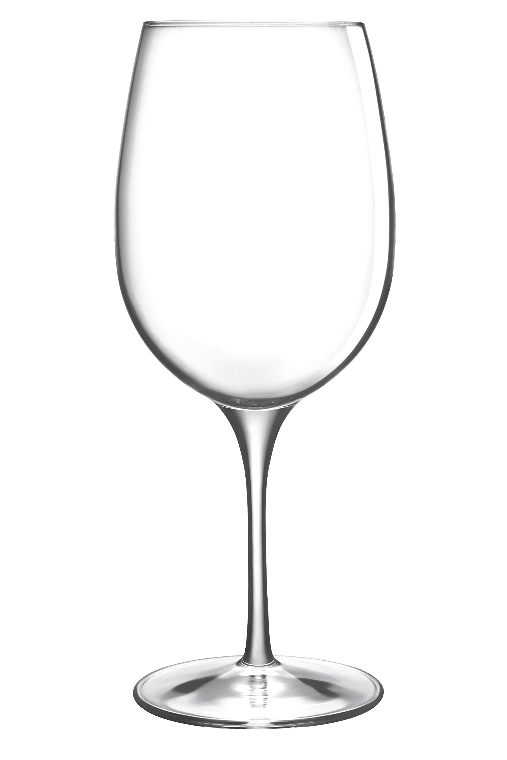
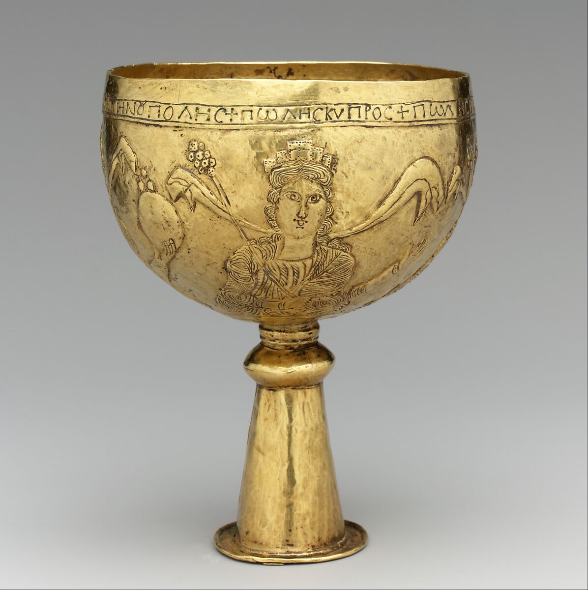
Imagine that you have before you a flagon of wine. You may choose your own favourite vintage for this imaginary demonstration, so that it be a deep shimmering crimson in colour. You have two goblets before you. One is of solid gold, wrought in the most exquisite patterns. The other is of crystal-clear glass, thin as a bubble, and as transparent. Pour and drink; and according to your choice of goblet, I shall know whether or not you are a connoisseur of wine. For if you have no feelings about wine one way or the other, you will want the sensation of drinking the stuff out of a vessel that may have cost thousands of pounds; but if you are a member of that vanishing tribe, the amateurs of fine vintages, you will choose the crystal, because everything about it is calculated to reveal rather than hide the beautiful thing which it was meant to contain.
Bear with me in this long-winded and fragrant metaphor; for you will find that almost all the virtues of the perfect wine-glass have a parallel in typography. There is the long, thin stem that obviates fingerprints on the bowl. Why? Because no cloud must come between your eyes and the fiery heart of the liquid. Are not the margins on book pages similarly meant to obviate the necessity of fingering the type-page? Again: the glass is colourless or at the most only faintly tinged in the bowl, because the connoisseur judges wine partly by its colour and is impatient of anything that alters it. There are a thousand mannerisms in typography that are as impudent and arbitrary as putting port in tumblers of red or green glass! When a goblet has a base that looks too small for security, it does not matter how cleverly it is weighted; you feel nervous lest it should tip over. There are ways of setting lines of type which may work well enough, and yet keep the reader subconsciously worried by the fear of 'doubling' lines, reading three words as one, and so forth.
Now the man who first chose glass instead of clay or metal to hold his wine was a 'modernist' in the sense in which I am going to use that term. That is, the first thing he asked of his particular object was not 'How should it look?' but 'What must it do?' and to that extent all good typography is modernist.
Wine is so strange and potent a thing that it has been used in the central ritual of religion in one place and time, and attacked by a virago with a hatchet in another. There is only one thing in the world that is capable of stirring and altering men's minds to the same extent, and that is the coherent expression of thought. That is man's chief miracle, unique to man. There is no 'explanation' whatever of the fact that I can make arbitrary sounds which will lead a total stranger to think my own thought. It is sheer magic that I should be able to hold a one-sided conversation by means of black marks on paper with an unknown person half-way across the world. Talking, broadcasting, writing, and printing are all quite literally forms of thought transference, and it is the ability and eagerness to transfer and receive the contents of the mind that is almost alone responsible for human civilization.
If you agree with this, you will agree with my one main idea, i.e. that the most important thing about printing is that it conveys thought, ideas, images, from one mind to other minds. This statement is what you might call the front door of the science of typography. Within lie hundreds of rooms; but unless you start by assuming that printing is meant to convey specific and coherent ideas, it is very easy to find yourself in the wrong house altogether.
Before asking what this statement leads to, let us see what it does not necessarily lead to. If books are printed in order to be read, we must distinguish readability from what the optician would call legibility. A page set in 14-pt Bold Sans is, according to the laboratory tests, more 'legible' than one set in 11-pt Baskerville. A public speaker is more 'audible' in that sense when he bellows. But a good speaking voice is one which is inaudible as a voice.
I once was talking to a man who designed a very pleasing advertising type which undoubtedly all of you have used. I said something about what artists think about a certain problem, and he replied with a beautiful gesture: 'Ah, madam, we artists do not think---we feel!' That same day I quoted that remark to another designer of my acquaintance, and he, being less poetically inclined, murmured: 'I'm not feeling very well today, I think!' He was right, he did think; he was the thinking sort; and that is why he is not so good a painter, and to my mind ten times better as a typographer and type designer than the man who instinctively avoided anything as coherent as a reason. I always suspect the typographic enthusiast who takes a printed page from a book and frames it to hang on the wall, for I believe that in order to gratify a sensory delight he has mutilated something infinitely more important.
I remember that T.M. Cleland, the famous American typographer, once showed me a very beautiful layout for a Cadillac booklet involving decorations in colour. He did not have the actual text to work with in drawing up his specimen pages, so he had set the lines in Latin. This was not only for the reason that you will all think of; if you have seen the old typefoundries' famous Quousque Tandem copy (i.e. that Latin has few descenders and thus gives a remarkably even line). No, he told me that originally he had set up the dullest 'wording' that he could find (I dare say it was from Hansard), and yet he discovered that the man to whom he submitted it would start reading and making comments on the text. I made some remark on the mentality of Boards of Directors, but Mr Cleland said, 'No: you're wrong; if the reader had not been practically forced to read---if he had not seen those words suddenly imbued with glamour and significance---then the layout would have been a failure.
Setting it in Italian or Latin is only an easy way of saying "This is not the text as it will appear".'
Let me start my specific conclusions with book typography, because that contains all the fundamentals, and then go on to a few points about advertising.
The book typographer has the job of erecting a window between the reader inside the room and that landscape which is the author's words. He may put up a stained-glass window of marvellous beauty, but a failure as a window; that is, he may use some rich superb type like text gothic that is something to be looked at, not through. Or he may work in what I call transparent or invisible typography. I have a book at home, of which I have no visual recollection whatever as far as its typography goes; when I think of it, all I see is the Three Musketeers and their comrades swaggering up and down the streets of Paris. The third type of window is one in which the glass is broken into relatively small leaded panes; and this corresponds to what is called 'fine printing' today, in that you are at least conscious that there is a window there, and that someone has enjoyed building it. That is not objectionable, because of a very important fact which has to do with the psychology of the subconscious mind. That is that the mental eye focuses through type and not upon it. The type which, through any arbitrary warping of design or excess of 'colour', gets in the way of the mental picture to be conveyed, is a bad type.
The running headline that keeps shouting at us, the line that looks like one long word, the capitals jammed together without hair-spaces—these mean subconscious squinting and loss of mental focus. And if what I have said is true of book printing, even of the most exquisite limited editions, it is fifty times more obvious in advertising, where the one and only justification for the purchase of space is that you are conveying a message---that you are implanting a desire, straight into the mind of the reader. It is tragically easy to throw away half the reader-interest of an advertisement by setting the simple and compelling argument in a face which is uncomfortably alien to the classic reasonableness of the book-face. Get attention as you will by your headline, and make any pretty type pictures you like if you are sure that the copy is useless as a means of selling goods; but if you are happy enough to have really good copy to work with, I beg you to remember that thousands of people pay hard-earned money for the privilege of reading quietly set book-pages, and that only your wildest ingenuity can stop people from reading a really interesting text.
