Max Bill
On Typography
in Scheizer Graphische Mitteilungen, Number 4, 1946.
It's worth taking a look once again at the state of typography today. When one does this as an
outsider, who occupies himself more with the stylistic characeteristics of the epoch than with the
ephemeral manifestations of momentary fashion, and if one sees in typography primarily a
means of creating cultural documents, th[e]n one can impartially deal with the problems which
grow out of typographic material, their suppositions and their design.
Recently, one of the well-known typographic theorists remarked that the "neue typografie,"
which had enjoyed increasing popularity from 1925 until 1933 in Germany, had been primarily
used for printed advertising matter and that it was obsolete today; for the design of normal
printed matter, such as books and, above all, literary works, it is unsuitable and should be
abandoned.
Every posited theory that is fixed and unchangeable contains the inherent danger of becoming
inflexible and blocking development over time. But it is very unlikely that the so-called
"asymmetric" or organically formed text layout would be more quickly obsolete through progress
than the mid-axis type, which primarily corresponds to a decorative and non-funcitonal view of
things. Fortunately, we have liberated ourselves from the renaissance model and do not want to
return to it again; rather, we want to take advantage of this liberation and its potential. The lack
of principle in the old model has been conclusively proven – more convincingly than the return
to this model. Experience teaches that modern typography was on the right path in 1930.
Unfortunately, it is often the typographers themselves who lose their way and not just their
theorists. This must be clearly stated. Many typographers would like to be something "better," in
their opinion, than a typographer. They would like to be graphic designers or artists, cerate
typefaces, and compose drawings and linoleum cuts. And certainly there is no reason to object
a typographer wanting to be an artist. Buto ne can unfortunately see in most cases that he
never moves beyond mediocrity when leaving his inherent working basis. For typography itself
is, in its purest form, highly suitable for producing artistic work.
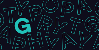
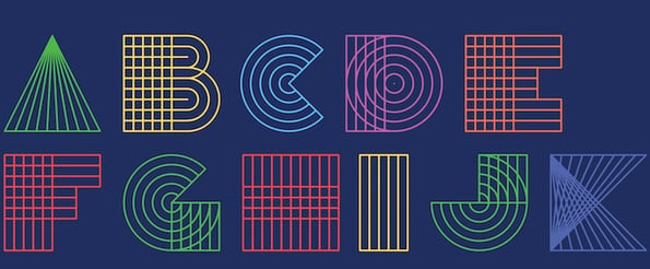
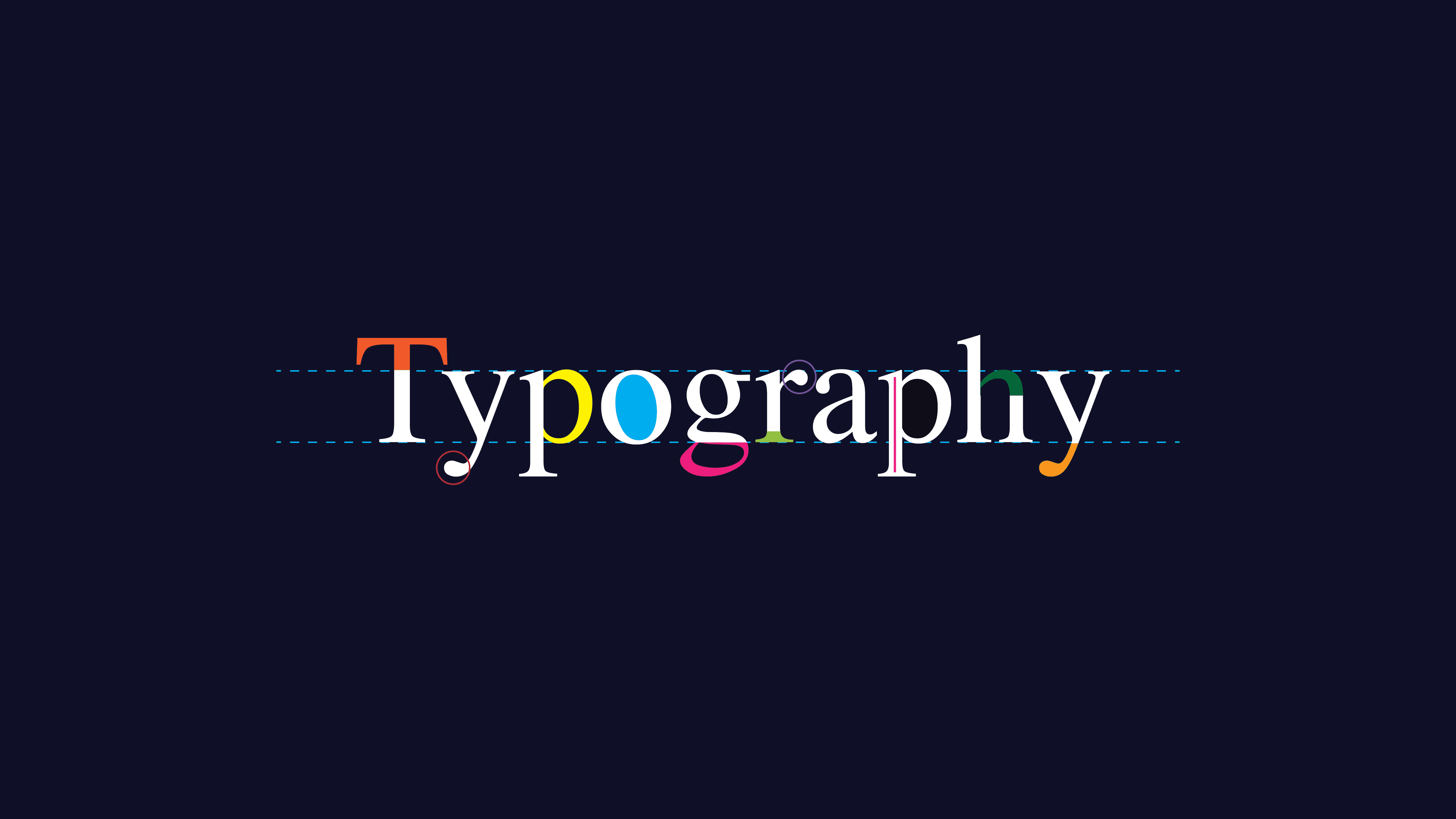
Typography is the design of the text, in a similar way as modern concrete art is the design of
surface rhythms. These text images consist of letters, which form words. The relationships and
differences in size among the letters and the various type sizes are precisely determined. In no
other commercial art profession does there exist such a mass of precise givens for design as in
the typography branch. This precise base material determines the character of typography.
If we view this base material more exactingly, then we can observe that it is suited for the
development of an exact rhythm that expresses itself in calculable proportions constituting the
appearance of the printed articles and presenting the characteristic aspect of graphic art. To
achieve consistently satisfying results with this mathematically exacting material that stands in
blatant opposition to the arbitrariness of the written word-image and lend it a perfect form, is not
always so easy. Yet this remains the goal of every typographic-artist enterprise. For, above all
the requirements of language and legibility must be fulfilled before purely aesthetic deliberations
can find attention. A text-image will always be most perfect when it harmoniously connects a
logical visual path with typographical and aesthetic parameters.
Typography that is developed solely out of the given circumstances, meaning it works in an
elementary manner with the base constituents of typography, we call "elementary typography."
When this typography is also directed towards designing text such that it becomes a living text
organism, void of decorative trimmings and torment, then we would like to call it "functional" and
"organic typography." What this then means is that all factors should be equally fulfilled – the
technical, economical, functional and aesthetic requirements – and influence the text
collectively.
The transformation from the "neue typografie" in 1930 to the functional typography of our day
can be seen through a variety of factors: the disappearance of thick rules and liens, large dots,
over-sized page numbers and similar attributes – all characteristic and fashionable ornaments of
the past. These attributes later proved themselves useful for a time as fine lines in order to order
and accent the typeface. All of these elements are unnecessary and superfluous today when
the text itself is correctly organized and when the word groups work together with the right
proportions. This is not to say that such ornamentation should in principle be eliminated. It is
generally just as necessary as any other form of ornament and by its omission the typographic
text gains in simple spatial excitement and quiet self-same clarity.
Opponents of functional typography claim that the common text image, the mid-axis text
possesses exactly this internal clarity itself and that, above all, in book typography any
departure from the norm is reprehensible. They retreated to the "traditional" book and claim that
a book must be created within the style of its time. In any case they make use of principles form
the past, with the aid of various typeface mixtures and the use of antiquated decoration and
ornamental lines (which we call "ornament by the meter" in architecture because it is produced
that way).
In this way a "new" fashion-oriented typography is being propagated, a kind of
typographic "heimatstil" [vernacular style], which is even being used for modern and progressive
books produced with contemporary typesetting machinery.
We regard such a course as reprehensible. Not only is the argumentation often inapplicable (for
example with Plato, Confucius, etc.), where in books must be printed in the style of their day
(Schiller and Goethe in the style of the last century, for example); but, it discloses a clear fear of
the problems and consequences which arise out of a functional typography. This is a flight into
the conventional as an expression of a backwards-oriented historicism.
What would one think though about an electrician who declares one day that a petrol lamp is
cozier, more comfortable and aromatic than an electric lamp? Certainly we would defend
ourselves if someone wanted to turn back technical developments 100 to 200 years in order to
lead us back to the lifestyle of an earlier time. Such a mad dash through antiquity would
disappear quickly; one would recognize the advantages of the technical potentialities and the
resulting logically arising forms as well as their artistic expressiveness. One would arrive at the
insight that progress really does come from moving forwards and that one can never call
something progress which comes from turning back, such as has been done with partial
success in recent years.

Several examples are provided here which should show the path by which functional and
organic typography can proceed. In each case it was the intention to establish a logical
construction with the resulting expression in a harmonious whole, which clearly and distinctly
corresponds to the technical and artistic possibilities of our time.