I saw this only later, in democratic Switzerland. Since then I have ceased publicizing the New Typography. The creators of the New Typography were, like myself, most vehement enemies of Nazism (only two, Prof. M.B., Essen, and Dr. W.D., Jena, went over to it). At the beginning of the so-called Third Reich my wife and I were taken into 'protective custody' for an extended period, i.e. we were thrown into prison and I lost my teaching position in Munich. Since freedom of thought and work for me come before everything else, I left my homeland and moved to Basle.
For we considered ourselves pioneers of 'progress' and wanted nothing to do with such obviously reactionary things as Hitler planned. When Hitler 'culture' called us 'cultural Bolsheviks' and called the works of like-minded painters 'degenerate', it was using the same obfuscating, falsifying methods here as everywhere else. The Third Reich was second to none in accelerating technical 'progress' in its was preparations while hypocritically concealing it behind propaganda for medieval forms of society and expression. And since deception was its basis, it could not bear the genuine modernists who, although political opponents, were nevertheless unwittingly not so far from the delusion of 'order' that ruled the Third Reich. The role of leader that fell to me as the only specialist of the group was itself a 'Führer' role, signifying, as it did, an intellectual guardianship of 'followers' typical of dictator states.
The New of functional Typography is well suited for publicizing industrial products (it has the same origin), and it fulfills that purpose now as well as then. Yet its means of expression are limited because it strives solely for puritanical 'clarity' and 'purity'. This changed only circa 1930 when seriffed types were accepted as permissible means of expression. It became clear that only types of the nineteenth century could be used; I finally discovered that the New Typography was actually nothing more than the fulfillment of what the progress-happy nineteenth century had been striving for. And in the type-mixtures of the later New Typography, only the types of nineteenth century could be used. Bodoni was the forerunner of the New Typography insofar as he undertook to purge roman type of all traces of the original written form and - fortunately less radical than some of his recent twentieth-century disciples - to reconstruct it from the simplest possible geometric elements.
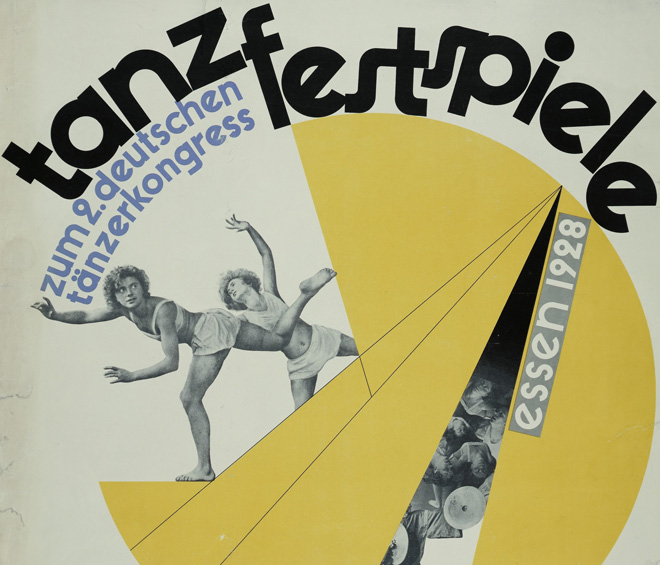
1928. Poster for the Second German Dance Congress
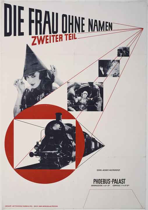
Jan Tschichold-The Woman Without a Name
But there are many typographical problems which cannot be solved on such regimented lines without doing violence to the text. Every experienced typographer knows this. Many jobs, especially books, are far too complicated for the simplifying procedures of the New Typography. And the extremely personal nature of the New Typography presents grave dangers to the coherence of a work when the designer cannot continually check each page and deal with all the minute problems that arise. For it has been shown that the apparently simple rules of functional typography are not common knowledge, because they spring from a special, in effect fanatical, attitude of conspirators into whose group one must first be 'initiated'. Traditional typography is quite different: it is far from being unorganic, it can easily be understood by everybody, its finer points are not difficult to appreciate, it presumes no sectarianism and its application in the hands of a beginner does not produce nearly so many blunders as the New Typography in the hands of the uninitiated.
Bill's present-day typography is marked, like my own work between 1924-35, by a naïve worship of so-called technical progress.
The designer who works in this manner values the mechanical production of consumer goods -- a characteristic of our times -- to highly. We cannot escape manufacturing and using such goods, but we need not place halos over them, just because they come off the conveyor belt assembled with the latest 'efficient' methods.
The machine can do everything. It has no law of its own and cannot shape anything by itself. Its products are given form by man, by the designer's will, even when he believes himself to be 'obeying its laws' and that his 'objective' and unornamented designs are 'impersonal'. The work of a one-hundred-percent 'modern' designer is far more individualistic than items produced unambitiously, anonymously, unthinkingly -- which must not prevent us from recognizing a product to be good of its kind and preferring it when it serves its purpose as well as another. But the non-artist does not care in the least if the manufacture of his typewriter or whatever called for a minimum of production time or if the hydraulic press was overloaded. He does not even care if the workers are justly paid, a matter that actually should be of concern to him. He asks only that the typewriter be useable and is happy if it is also cheap.
An artist like Bill probably does not realize what a price in blood and tears the use of efficient production methods as cost 'civilized' humanity and every single worker. For these new machines give Bill or another designer time to play but not to the worker, who, day in and day out, has to tighten the same screw. Since his job cannot satisfy him, this worker seeks relaxation in sports on Sunday and with his stamp collection or some other hobby in the evenings. How different for, say, a gardener, whose work satisfies him and who probably does not think of 'relaxing' at the cinema. Proudly, though here and there quite wrongly, Bill notes in his captions that his examples were machine-set. He forgets that the hand compositor, who must make up and complete the work of the keyboarder, has nowhere near the satisfaction from his work that his grandfather could have found in it. Since he always handles type already set, he cannot finish his day with a feeling of having completed a job by himself.